

Chris Maple designed the Pokémon logo in one month for Nintendo
1998 rush job created one of pop culture's most recognisable logos, virtually unchanged for 25+ years
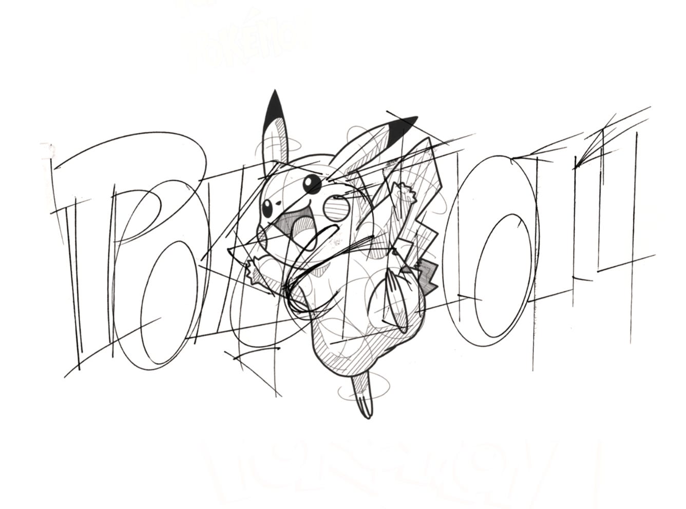
In 1998, designer Chris Maple got a surprise call from Nintendo of America. Through the office of president Minoru Arakawa, Maple was handed the job of creating the logo for Pokémon, a Japanese hit video game series about to make its US debut. The challenge: just one month to deliver.
Maple explored multiple directions before landing on the bold look we all know today: chunky yellow letters outlined in blue, arched as if bursting with energy. The oversized “P” and “K” gave it personality, whilst the colour scheme made it pop on shelves.
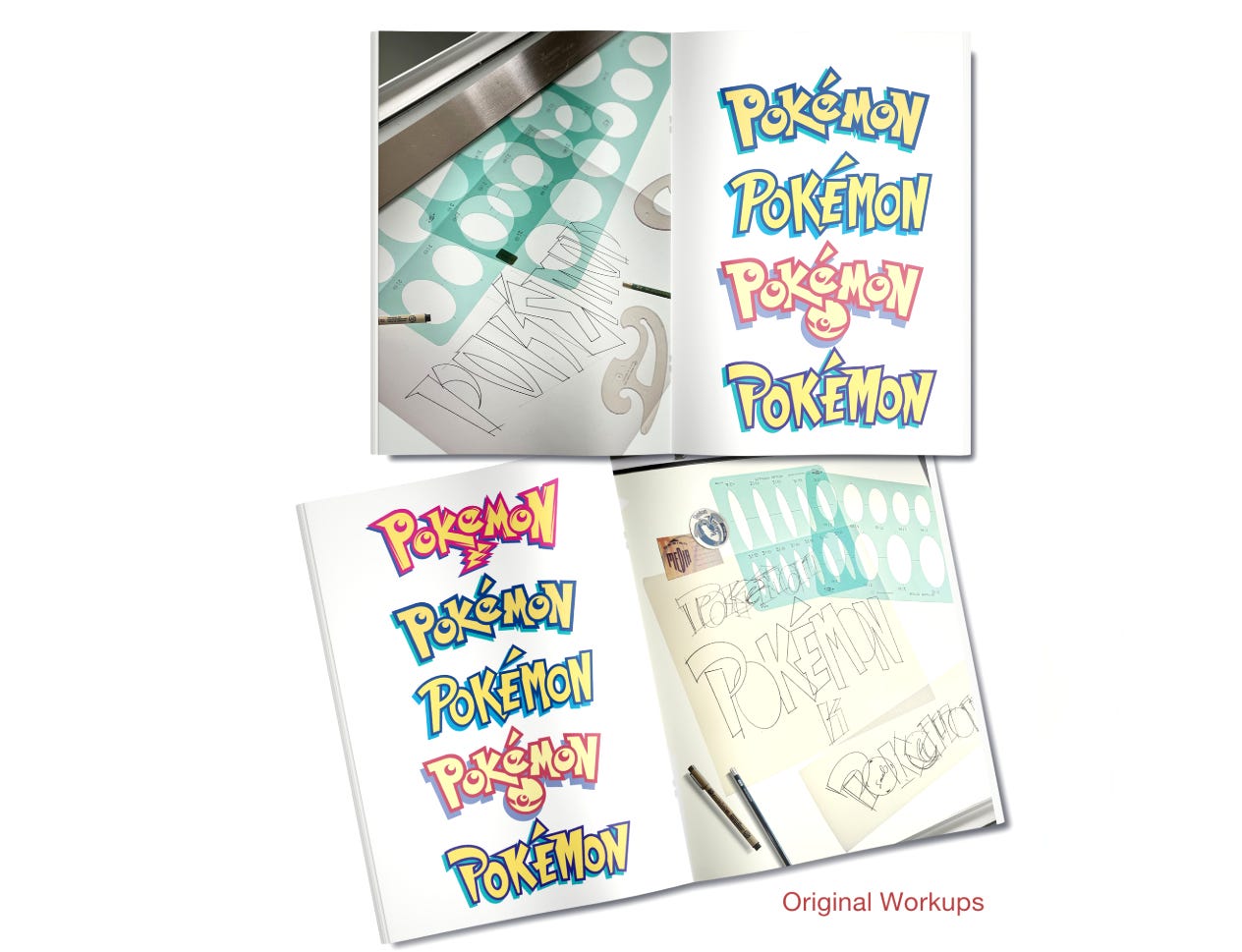
What began as a frantic rush job became one of the most recognizable logos in pop culture, virtually unchanged for more than 25 years. The evolution from initial green concepts to the final friendly, approachable design suggests Nintendo steered the direction toward something more playful and accessible, resulting in a logo that perfectly captured Pokémon’s energetic spirit whilst remaining timeless enough to survive decades of cultural shifts.
See Link
Inspiration by Lucy