



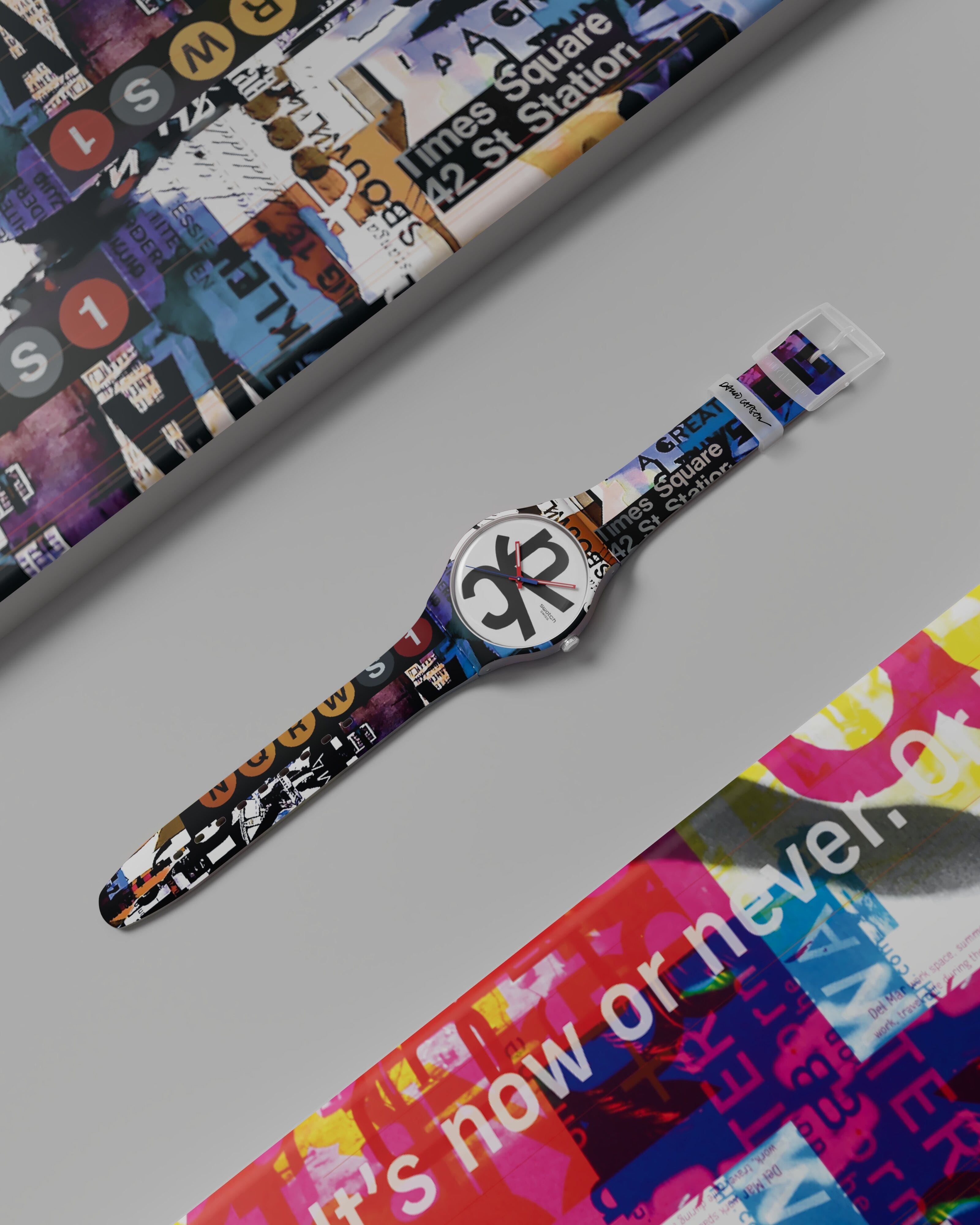
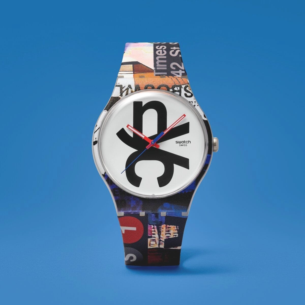
CARSON TIME is the latest release in Swatch’s Destination Art series, each watch built for a specific city with a local artist, and this one’s a tribute to New York from David Carson, whose work for Beach Culture, Bikini and Ray Gun in the 1990s brought a whole new approach to type and page design, breaking with traditional layout systems that inspired me and a whole generation of students and young designers. Who cares about legibility, the collages built from found paper, printed ephemera and blurred photographs mattering more for what they made you feel than for what they let you actually read.

Carson’s a genuine Swatch obsessive too, known for wearing several watches at once, so the brand handing him a New York tribute makes more sense than most artist collaborations manage, and he ended up designing so many strong directions for the piece that picking just one proved impossible, which is why CARSON TIME becomes the first Destination Art watch to carry two different designs, one on the front and one on the back. Subway signage, street posters, urban texture and bursts of colour capture what he calls the city’s chaotic, somehow organised energy on one side, while the back carries a bit of New York’s dry irreverence, hidden details built for people to notice on a second look rather than the first.
Love this.
Inspiration by Mark
See Link